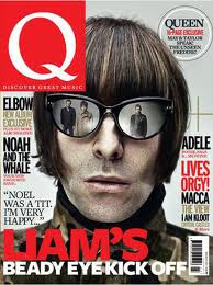
For my front cover I have taken a lot of influence from similar music magazines like Q and NME. For example, I have used the same colour palette of black, red, white and black, as well as gold for some of the sell lines. I used different colour combinations for my sell lines, as done in Q, in order to prevent my magazine from looking too plain. I also placed an embelishment in the corner, as I noticed that it is a common feature in music magazines of any genre. I wanted to have my front cover model in the same style of pose as the models of similar music magazines-a close-up shot, showing the model form the shoulders up, and with the eyeline around the middle third of the page, in order to directly address the reader.


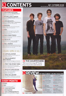
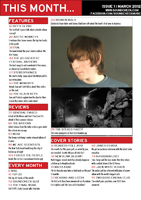
My contents page is based heavily on that of Q magazine, as my audience research showed that the layout was well received. I decided to have four sections to my contents page in order to show the magazine had a lot of content, but not too much. I used the same three colour palette I used for my front cover for continuity. I made the heading of the page 'This Month' rather than 'Contents' as I thought it would give the feel that the content of the magazine was the most important news of the month.
For my Double Page Spread I took inspiration from this DPS from Q. Like Q and similar magazines, one page is taken up by an image, while the other page contains the heading and the beginning of the article. I decided not to make the heading for my article as big as the heading in this example, and instead use more space for the article itself.


No comments:
Post a Comment