Matthew Jenkinson
Tuesday, 12 June 2012
Thursday, 10 May 2012
Evaluation Question 7-Looking back at your preliminary task, what do you feel you have learnt in the progression from it to the main task?
Research and Planning
My research and planning skills have improved a lot from my prelim to my final product. For my prelim, my planning only involved a flat plan, with no research. However, for my final product I had researched magazines, audiences, demographics, fonts, photography and articles in order to produce a professional looking magazine that fittingly represented the genre of music I had chosen. I also collected secondary data about my audience (hobbies, interests and preferences) from the internet, and also did some research on how media publishers produce and market similar magazines.
Planning for my prelim magazine was very short, and involved producing a flat plan and constructing the magazine. The planning for my main product was a lot longer and covered a lot more areas, involving flat plans, research into articles, photography and models, and then constructing the product.

Construction
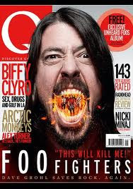
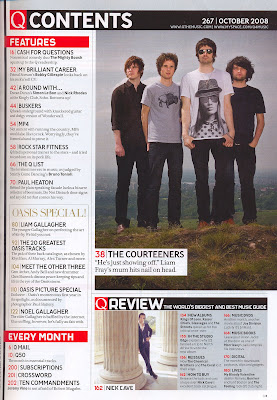
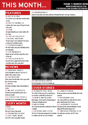
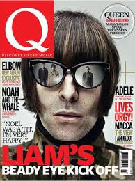
As you can see clearly from my two front covers and contents pages (prelim top, final product second), my software and hardware skills have largely improved. I have developed a lot more skills on Photoshop, as I started with simple text boxes and am now able to add embellishments and effects to my products. My skills on InDesign have also improved, as I am now able to create a more professional looking contents page with organised sections.
Wednesday, 28 March 2012
Evaluation Question 6-What have you learnt about technologies from the process of constructing this product?
During the production process, I used the Apple macs,and created my products with the programs Photoshop and InDesign. Using these programs have helped me create a product that looks professional, and one that I am pleased with.
Photoshop
With Photoshop I have learnt how to add embellishments and banners to my magazine, rather than plain text boxes, as well as how to add downloaded fonts to use for my magazine. I have also learnt how to export a Photoshop file into a JPEG in order for it to be accessed on InDesign and uploaded onto my blog.
With Photoshop I have learnt how to add embellishments and banners to my magazine, rather than plain text boxes, as well as how to add downloaded fonts to use for my magazine. I have also learnt how to export a Photoshop file into a JPEG in order for it to be accessed on InDesign and uploaded onto my blog.
InDesign
Using InDesign to produce my contents page and double page spread, I have learnt a lot about putting texts into columns, adding headings and captions, and creating an organised product. Like Photoshop, I also learnt how to install downloaded fonts, and export files as a JPEG.
Using InDesign to produce my contents page and double page spread, I have learnt a lot about putting texts into columns, adding headings and captions, and creating an organised product. Like Photoshop, I also learnt how to install downloaded fonts, and export files as a JPEG.
Blogger
I have used Blogger in order to upload my research and planning, evaluation, as well as my products. Using blogger I have learnt how to import my products from Photoshop and InDesign, as well as posting links to things such as presentations.
Prezi
I used Prezi in order to make a presentation of my research into similar magazines. I also used it in order to answer evaluation question 1. Using Prezi I have learnt how to make a better looking, more detailed presentation (as opposed to Microsoft Powerpoint)
Google Images
I used Google Images during the research stage of my product, to find the front cover, contents page and double page spread of similar magazines.
Dafont
I used Dafont in order to find fonts that would suit my magazine and help give it a professional look. Using Dafont I have learnt how to download a font to use in Photoshop and InDesign.
Tuesday, 27 March 2012
Evaluation Question 5-How did you attract/address your audience?
For my front cover I have taken a lot of influence from similar music magazines like Q and NME. For example, I have used the same colour palette of black, red, white and black, as well as gold for some of the sell lines. I used different colour combinations for my sell lines, as done in Q, in order to prevent my magazine from looking too plain. I also placed an embelishment in the corner, as I noticed that it is a common feature in music magazines of any genre. I wanted to have my front cover model in the same style of pose as the models of similar music magazines-a close-up shot, showing the model form the shoulders up, and with the eyeline around the middle third of the page, in order to directly address the reader.


My contents page is based heavily on that of Q magazine, as my audience research showed that the layout was well received. I decided to have four sections to my contents page in order to show the magazine had a lot of content, but not too much. I used the same three colour palette I used for my front cover for continuity. I made the heading of the page 'This Month' rather than 'Contents' as I thought it would give the feel that the content of the magazine was the most important news of the month.
For my Double Page Spread I took inspiration from this DPS from Q. Like Q and similar magazines, one page is taken up by an image, while the other page contains the heading and the beginning of the article. I decided not to make the heading for my article as big as the heading in this example, and instead use more space for the article itself.
Monday, 26 March 2012
Evaluation Question 4-Who would be the audience for your media product?
I created this moodboard in order to give a visual representation of my target audience, and shows their taste and preferences in terms of music, brands, television and film. My target audience is mainly between the ages of 16-24 years old and would most likely fit into the 'Indie' or 'Alternative' social groups, with around 70% being male and 30% female.
Sunday, 25 March 2012
Saturday, 24 March 2012
Evaluation Question 2-How does your media product represent particular social groups?
With my products I have tried to represent the 'Indie' and 'Alternative' social groups. One of the ways I have done this is by displaying bands from these genres in my sell lines to represent these social groups. Examples include Foster The People, Miles Kane, General Fiasco and Jack White.
Another way I have represented these social groups is with costume. The Indie genre is usually represented with light hoodies, t-shirts and jeans, which is what my models are wearing in order to represent the indie genre.
Subscribe to:
Comments (Atom)


