Saturday, 1 October 2011
Thursday, 22 September 2011
Inspirational Texts
I feel that this cover has an effective layout. As you can see, the main sell line is in the middle of the page, accompanied by a sub heading and image, which takes up most of the space on the page. As well as that, sell lines for other articles and features of the magazine are placed in various places of the cover. The mast head is in clear view, slightly obstructed by the image from the main article, and the sell line of a smaller article.
This is also a well laid out cover. The text and border are made to match the colours in the image. Like the first cover, the main sell line is in the middle of the page in a large font, and also features an image and sub heading. The sell lines for other articles in the magazine are slightly tilted to use up more space, and are closer to one another, as opposed to being scattered in other places, like the first cover.
I think that this contents page is effectively laid out, as it has a good balance of image and text. In the top half of the page, you can see a large image of one of the main articles with two smaller images from two other articles, each accompanied with the page number it is on. The bottom half of the page features the contents itself, split into five main sections: News, Live Reviews, Features, Album Reviews, and a Gig Guide. It also includes smaller features of the magazine, the mast head from the front cover of the magazine, and also a foreword from the editor.
Brief:print
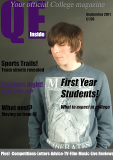
Preliminary exercise: using DTP and an image manipulation program, produce the front page of a new school/college magazine, featuring a photograph of a student in medium-close up plus some appropriately laid out text and a mast/head. Additionally you must produce a mock-up of the layout of the contents page to demonstrate your grasp of DTP.
Main task the front page, contents and double page spread of a new music magazine. A minimum of 4 images must be used, all images and graphics must be produced by the candidate.
Main task the front page, contents and double page spread of a new music magazine. A minimum of 4 images must be used, all images and graphics must be produced by the candidate.
Subscribe to:
Comments (Atom)


